Three views of one platform
The same card, told three ways. MAIN is V10 paper with the technical register turned up. DAW borrows the clip and piano-roll language, so a fee or a tier ladder arrives as notes on a grid. TERMINAL is a screen: prompt, output, manifest. Every one of them runs in light and dark.
Framing is done with blocks, columns, rails and ladders. No band runs the full width of a card any more: a full-bleed band cuts the sheet in half instead of holding it, and at thumbnail size that reads as an error rather than a decision. Palette and fonts are read out of ptd-doc-covers.html at build time.
The switch flips every card marked AUTO. The paired examples in the next section stay pinned, so both modes are always visible at once.
Main, DAW, terminal
Three registers, one system. They share the palette, the fonts, the sign-off and the law; what changes is what the card is pretending to be. Pick by content. Prose and product take MAIN. Anything with a sequence or a ladder in it takes DAW. Anything with a state or a record in it takes TERMINAL. Each is shown light, then dark.
V2.0
2026·08·06
THE QUEER COMMUNITY
A queer platform to buy and sell.
for artists, brands, creatives and divas to buy and sell their work, services, and more.
V2.0
2026·08·06
THE QUEER COMMUNITY
A queer platform to buy and sell.
for artists, brands, creatives and divas to buy and sell their work, services, and more.
V10 paper with the technical register turned up: a tri-color key block holding the eyebrow, a corner index, a chip rail naming the houses. Prose and product live here.
COVER · MANIFESTO · PRODUCTThe clip. Ruler, key sidebar, notes on a grid, a header naming the clip. A tier ladder is literally a chord: six notes, each at its own pitch, each in its own tone. Higher note, higher tier. DARK ONLY: DAW's light theme is a washed grey that reads as a disabled screenshot, and this view exists to look like an instrument.
LADDERS · SEQUENCES · SCHEDULESA screen. Prompt, comment, boxed output, block cursor. Box-drawing rules survive the no-divider law because they are CHARACTERS inside a depicted object, not furniture on a page.
FACTS · STATE · RECORDSLOCKED, 2026-08-06. Dark mode is real on MAIN and TERMINAL: a feed is not a page, and the phone it lands on is usually dark. It is a scoped exception to the white-ground law and it does NOT travel to the storefront, where white ground still holds. DAW is dark only. Its light theme is a washed grey that reads as a disabled screenshot, and this view exists to look like an instrument, so the ground toggle is a no-op on it by construction rather than by a note asking people to be careful.
Five ways to hold a card
Redone without a single full-width band. A spacing is where the copy sits and how much paper is left alone; every card in the kit resolves to one of these five. The framing device now has a size and a position, so it holds the sheet rather than slicing it.
LON 74.0060
NYC · 2026
A queer platform to buy and sell.
for artists, brands, creatives and divas to buy and sell their work, services, and more.
Copy in the bottom half, a tri-color KEY BLOCK top-left, a mono index top-right. The most air of the five and the default for a cover. The index is what gives the air a reason: it reads as a record, not an empty poster.
COVER · STATEMENT · THE OPENERno listing fee, no ad auction, no promoted placement bidding against you.
The band became a PANEL: a framed component with a coloured header bar. The colour is now inside something, which is the whole difference. A component's border defines it, so it survives the no-divider law.
PRICE · RATE · ANNOUNCEMENTThe culture creates the value. The culture should get paid.
Registration marks at the four corners and nothing else. Symmetric 14cqw margins. The poster, and the most sci-fi of the five: the ticks say the sheet is a plate that was aligned, not a canvas that was filled.
MANIFESTO · PULL QUOTE · TATTOO LINEThree families. Six ways in.
from $5 a month. help build the platform. perks along the way.
Copy top-left, a CHIP LADDER down the right. Six rungs, one per tier, the active one extended. It indexes the whole set without listing it, which is how a card carries six prices and still has air.
DOCUMENT · TIERS · EXPLAINER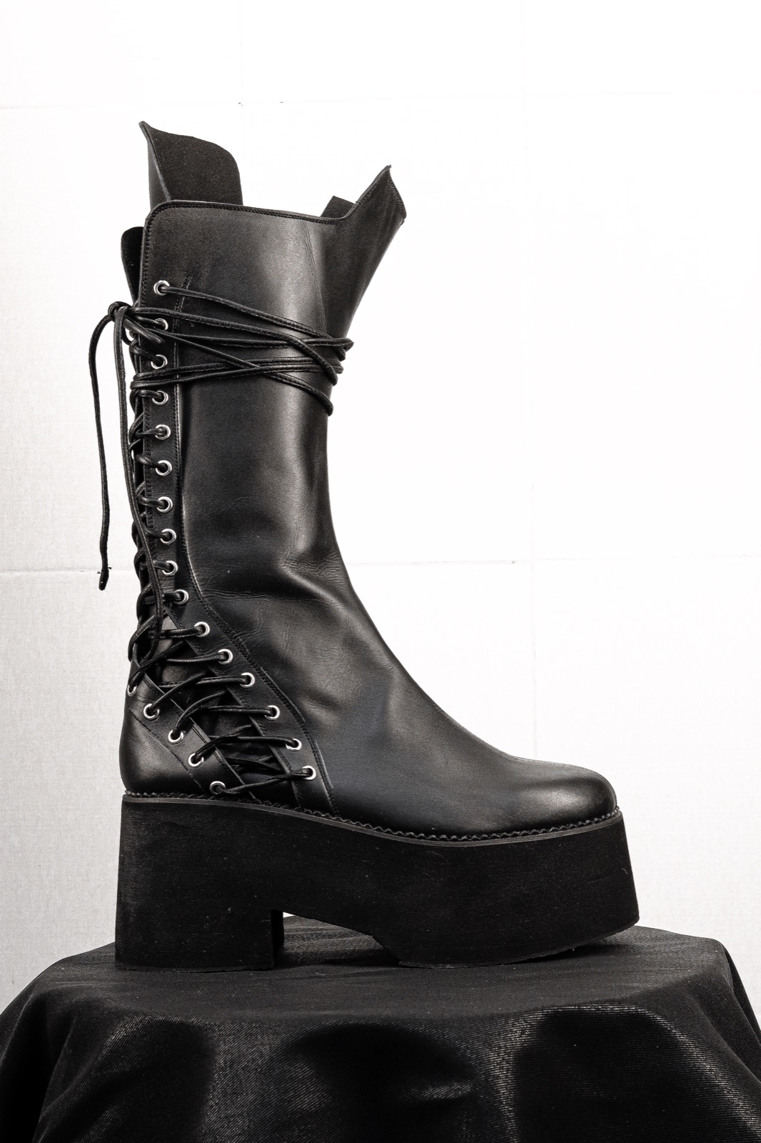
Welted. Hand-stitched.
The asset sits in an inset VIEWPORT with two opposing crop ticks, copy and a tri-color key underneath. The image is never full bleed here, and nothing is ever set on top of it.
PRODUCT · CAMPAIGN · EDITORIALWhat changed from V1. The full-bleed BAND is retired from the card system. It survives in the asset library for documents, where a letter sheet has the height to carry it, but on a 1080 canvas it reads as a card cut in half. Everything that framed with a band now frames with a block, a panel, a rail, a ladder or a crop tick.
Twenty
Ten built on strips, keys and tri-colors. Six in the DAW language. Four on the terminal. Every one is AUTO, so the switch at the top of the page flips all of them between light and dark at once.
STRIPS · KEYS · TRI-COLORShop the brands.
artists, brands, creatives and divas.
One tri-color block in the corner, at the size of a thumbprint. The quietest possible house signature and the one to reach for first.
HOUSE SIGNATURESTuDiØ ZØ
The tri-color stood up and set beside the headline, sized to its cap height. It reads as a marker in a margin rather than an ornament.
HOUSE PAGE · ARTIST PAGEShop every house.
The one ZØ kept. Chips along the foot at full core saturation, the active house marked by SIZE rather than by washing the others out. It indexes a carousel without a word.
CAROUSEL INDEX · THE KEEPERThe receipt is the marketing.
The rail stood on end at the right margin, which is exactly DAW's key sidebar. Use it whenever the card holds a position in a set.
SEQUENCE POSITIONDØLLs get paid first.
an internal savings account, funded by CLUB dues. not a cut of your sales.
Three tone steps as one short column in the outer margin. The card is not cut in half because the column stops well short of the copy.
THE FUND · RESERVE TONESilver, and it reads metallic.
A colour tab bracketed off the top edge like the tab on a file. It sits ON the card rather than across it, so the sheet stays whole.
FILED · CATEGORISEDRegistered.
REG. NO. 8,365,768L-brackets at two opposing corners. A partial frame, never a closed one: the eye completes it and the card keeps its air.
CREDIBILITY · THE MARKLaunch your brand.
beta. rolling review.
Crosshairs at the four corners. The most technical framing in the kit and the one that suits a work in progress or a spec.
BETA · SPEC · WIP#9BE23D · CORE
#6D9E17 · DEEP
The tri-color as three squares with their hex printed beside them. The palette used as content, which only works because the values are real.
BRAND KIT · SYSTEM POSTInfrastructure for the queer community.
Four single core chips at the edge midpoints. Almost nothing, and at thumbnail size it is the only device that still reads as intentional.
MINIMAL · THE QUIET ONEA single clip with its header bar and name. The header is the only place a colour runs edge to edge, and it is allowed because it is the top of a component, not a band across the card.
ANY FOUR-BEAT IDEAThe data IS the notes. Six tiers, six pitches, six tones, the cheapest at the bottom. It reads as a chord voicing, which is the correct emotional shape for a membership ladder.
LADDERS · PRICE SETSThe clip launcher. A four by four of slots, filled ones coloured and named, empty ones outlined. A content calendar that looks like an instrument.
CALENDAR · ROSTEROne lane per house, each with its header and its clip. Lengths carry meaning: a longer clip is a longer run. The roster as an arrangement.
ROSTER · TIMELINEA single timeline read as months. Clip start and length are the schedule, so a drop date is a position rather than a sentence.
DROP SCHEDULE · ROADMAPA chain of devices with their knobs. Each device is a step, and the rack shape says these run in order and feed each other.
PROCESS · HOW IT WORKSCommand, comment, answer, cursor. The shortest way to state one fact and the most quotable.
ONE FACT · THE ONE-LINERBoxed output. Box-drawing characters are content inside a depicted screen, which is the one place a rule is allowed anywhere in this system.
COMPARISON · THE SELLER PITCHA state readout with a block meter. Honest about what is not built yet, which is the only reason anyone believes the rest of it.
ROADMAP · TRANSPARENCYA directory listing. The roster as a filesystem, which is the most indexable shape there is and needs no house count to be complete.
ROSTER · OPEN CALLColour blocks and what they index
LOCKED. A tone is not chosen by taste, it is chosen by what the
surface is about. Two wheels and no crossover: MAIN indexes a section of the
platform, RESERVE indexes what a member pays. Every tone is a three step stack,
light over core over deep, and a block, chip, key, note or ladder rung always
draws from it. Assignments are read out of Mission Control's
lib/palette.ts at build time, which is the file that wins.
The rules that come with it. Chips are always at FULL CORE saturation and the active one is marked by SIZE, never by fading the others. Flat colour only, no gradient, no sheen, no metallic texture. A tone never crosses wheels: a CLUB tier may not take a MAIN family and a platform section may not take a RESERVE tone. VERS CAPITAL is HARRODS and is held off the ladder on purpose, so the account never shares a tone with a rung. The five tones marked OPEN are named but unassigned. Do not put one on a surface until it is given a job here.
Stories
One per view. Instagram's top bar covers about 11% of the frame and the reply strip about 14%; the hatched zones are drawn to scale and nothing readable may enter them. The clearances are set in cqw off the real 1080x1920, because a percentage margin resolves against WIDTH and would clear barely half of what is needed.
Buy and sell from the DØLLs.
a queer marketplace and fundraising platform.
The safe band is the whole working area. Key block above, chip rail below, link sticker in the lower third.
THE DEFAULTThe roll fills the safe band. A story is tall, which is the one canvas where a six-lane piano roll fits without compressing the lanes.
LADDERS AT 9:16The screen centred in the safe band. Mono at 2cqw is a real 21px on a 1080 story, which reads at arm's length.
STATE · ANNOUNCEMENTWhat carries, what changed
HOLDS EVERYWHERE- No divider lines. Two exceptions, both earned: the grid inside an DAW clip and the box-drawing inside a terminal. Both are CONTENT inside a depicted object. Neither may leave it.
- Headlines are one colour. Colour leads on keys, chips, notes, action blocks and stat digits, never inside display type.
- Nothing is rounded, nothing has a shadow. Radius 0 everywhere, with one exception: a device knob, because a knob is a depicted object.
- No em dashes, no
::. Full stop, colon, comma, middot. - Never write a house count. No "five houses", no "one checkout". The MANIFEST template is the answer: it lists the roster without counting it.
- Cards close with
next question?, lowercase, always.
- Full-width bands are out (ZØ, 2026-08-06). A band across the top or bottom cuts the sheet instead of holding it. Frame with a key block, a column, a rail, a ladder, a panel or a crop tick. The one survivor is a PANEL HEADER, which runs edge to edge across a COMPONENT rather than across the card.
- Dark mode is LOCKED on MAIN and TERMINAL, and DAW is DARK ONLY. A scoped exception to the white-ground law, for social cards only. It does not travel to the storefront.
- Three views, not one. A card picks MAIN, DAW or TERMINAL and the whole set keeps it. Mixing views inside one carousel is the same mistake as mixing spacings.
Rebuilding. Generated by
tools/build-social-templates.py. Fonts and every hex are read out
of ptd-doc-covers.html
at build time, so a tone that moves there moves here on the next run.