One wordmark, one symbol, a few lockups, and a glyph that is not optional. As of V12 the mark is registered, and the ® is set as punctuation.
The wordmark
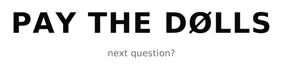
Set in mono, tracked open, always uppercase. It is deliberately not a drawn logo: it is type, set correctly, which is why it survives at any size and in any medium without a special file.
The needlefly

PTD NEEDLEFLY is the official symbol. A butterfly dagger: two opposed fans of straight ruled lines meeting at a waist, thrown between a rising point and a falling one. It also looks like a pen signing ink.
- It does not replace the wordmark. The registration is on the words, so the ® attaches to PAY THE DØLLS and never to the symbol.
- One mark, one weight. Black on paper, or reversed to paper on black. No colour version and no gradient version.
- Never redrawn or traced. The curve is made by straight lines, which is why it reads as drawn rather than illustrated.
- Raster only for now. The master is a 6250px PNG. No vector exists yet, so there is no SVG to download.
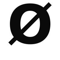
The Ø is non-negotiable
Related and distinct: KŌR COLLECTIVtakes a macron Ō, not a slash. It is that house’s own glyph and the two are never substituted for each other.
The lockups
| Mark | Use |
|---|---|
| Wordmark | The default. Everything, unless there is a reason. |
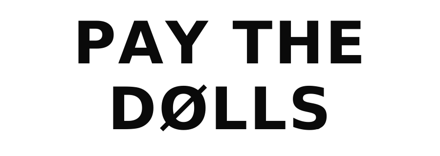
| Stacked | Square and near-square spaces where the line would run too small. |
| Two-line | Tall or narrow formats. |
| Glyph · Ø | Avatars, anywhere the full name will not read. |
| Symbol · the needlefly | The site icon and favicon for every in-house line. Partner houses keep their own marks. |
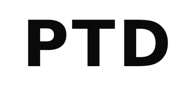
| Short · PTD | Internal and dense UI. Never the primary mark in public. |
Clear space and minimum size
- Clear space is the cap height of the mark on every side. Nothing enters it, including a page edge.
- Minimum size is the point at which the slash in the Ø still reads. Below that, use the glyph.
- Ground is white or black. Not a tone, not a photograph, not a colour block.
What you may never do
- Re-draw or re-space it. Including “fixing” the tracking.
- Recolour it. Ink or paper. Never a tone, never a gradient, never a fill of an image.
- Rotate, skew, arch, outline or add a shadow.
- Put it on a busy ground, or knock it out of a photograph.
- Lock it to another mark without a licence. Co-branding is a licensing conversation.
- Swap the Ø for an O. Stated twice because it happens most.
The trademark
PAY THE DØLLS® is federally registered, Reg. No. 8,365,768, Principal Register, IC 025 and IC 035, owned by Studio Zo LLC. Copy anywhere calling it filed, published or applied-for is stale, and so is the ™. Full record in Licensing.
How the ® is set
- Always drawn in Bebas, whatever face surrounds it. The wordmark is SF Mono and the ® is the one Bebas glyph inside it. Its heavier ring still holds its counter at small sizes on a phone.
- It sits on the period line, not on the S. The S is round and dips below the baseline, and aligning to it hangs the mark below the line the D and L sit on.
- Tracked lockups claw the track back, or the mark floats off the S and reads as a footnote.
- In prose it is typed bare. A body paragraph already draws the ® small and high. The styling is for the wordmark only.
| Surface | Type size | Scale |
|---|---|---|
| Display · hero, band, opener, share card | 48px and up | .18 |
| Text · card titles, footer | 16 to 48px | .22 |
| Micro · labels, receipts | under 16px | .26 |
| Masthead · the site header | 24, 15, 13px | .30 |
The scale is keyed to the surface, never the viewport. A hero is still a hero on a phone. Never below .147, which is the size of a literal period: any smaller and the ring closes up and reads as dirt.
Files


Raster variants live under /brand/png/. Use the vector unless the destination cannot take one.